Kickapoo Cosmetics is a product line of facial washes, lotions, body washes, and other aromatherapy treatments to keep your mind and body in balance.
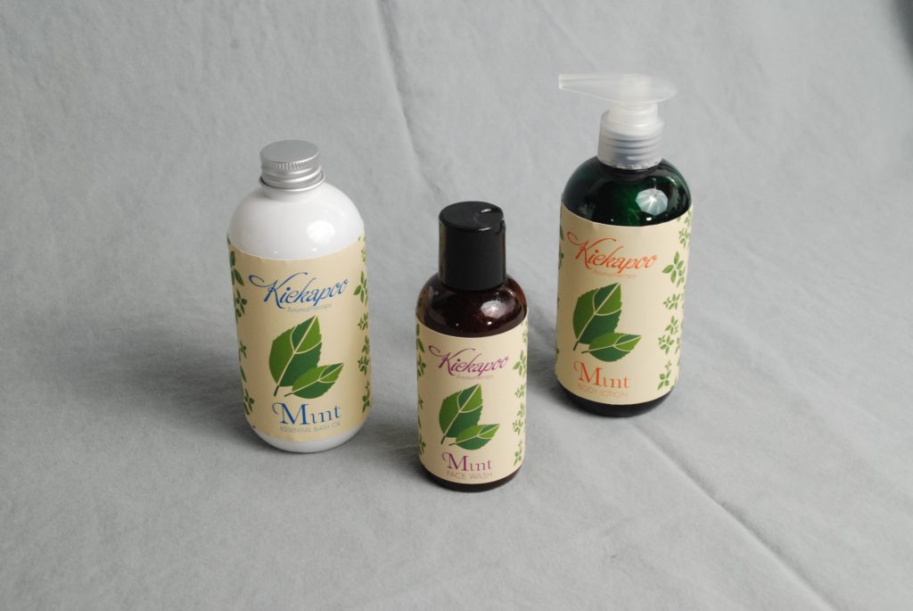
I wanted to keep the over all design to be simple yet decorative in nature. The products are easy to identify by color association and labels are easily read. The scent of the product is easily identifiable as it is the primary decoration on the label.
These were designed to be stand along products that serve as their packaging as well. Too often boxes and plastic are wasted on packaging and thus I created stand alone creations.
Creation Process
Round bottles (Boston Round) were chosen out of all bottle options as they provided a nice solid hold for the consumers hand. Boston rounds also had the most space to decorate. Other bottle designs were considered, but ultimately blended in too much with what is already on the shelves.
The labels were designed with vector graphics. The original idea was to use real images repeated, but the look became over done. Simplifying the images to their vector counter parts created the right look while still keeping the design simple (pictured below).
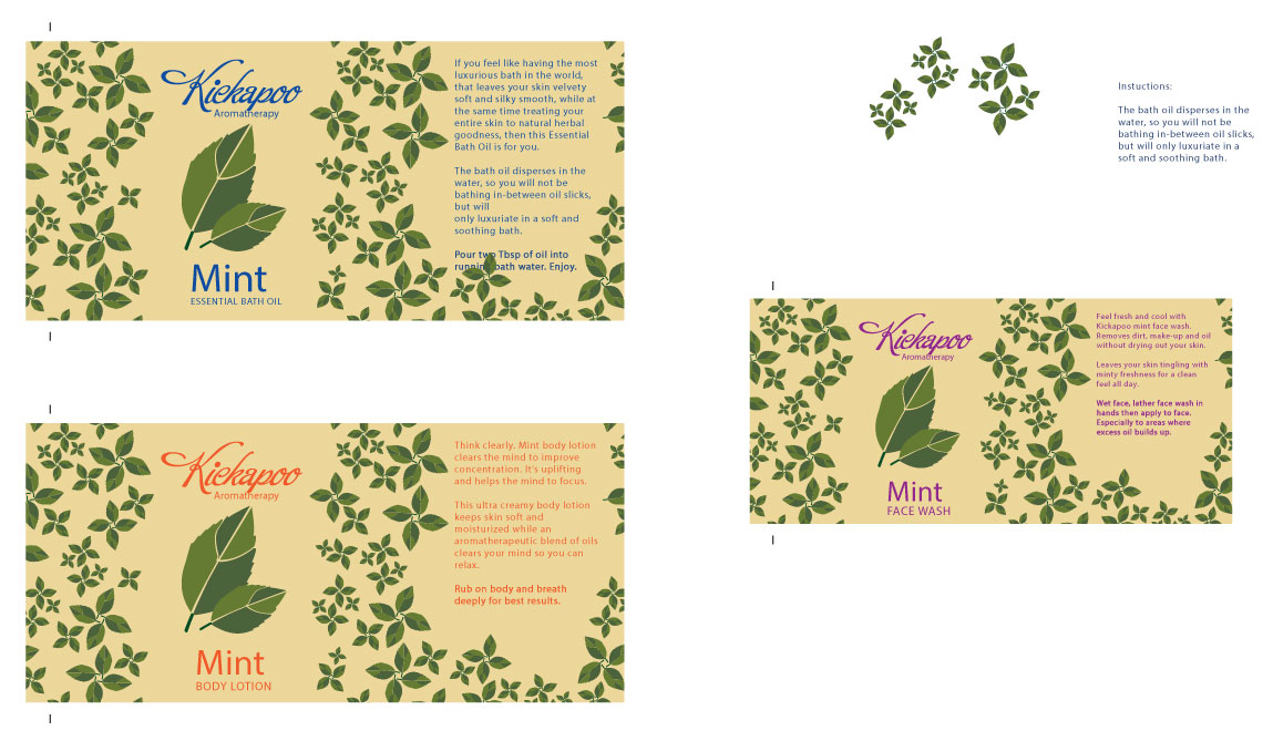
After the design was finished then the hunt for the correct font to compliment the look started (not pictured above). Organic Elements was chosen for the main scent title and was complimented with Geosans Light.
The colors were kept close to nature and muted. This way the corresponding color for the product line took front and center making the products easy to identify from one another.
I would like to expand Kickapoo Cosmetics to include bath salts in either short round topped containers or in tubes. This line has a lot to grow from still and I look forward to that expansion.